
Free & Premium
Case study
Atlassian’s cloud growth had slowed. Our single, per-user pricing tier created friction at both ends of the market - too expensive for startups, too limited for enterprises considering cloud migration.
Our product architecture reflected this constraint. Billing systems, user management, and product experiences were all built around legacy decisions that better reflected our server roots than our cloud-based future. We needed to redesign the entire pricing & packaging customer journey from first impression to enterprise scale.
🎯 Impact
- Opened the cloud funnel - Free and Premium plans removed barriers for millions of potential users
- Accelerated growth - Increased cloud revenue percentage from 50% to 60% within one year
- Delivered significant revenue impact - Contributed to over $100M revenue increase between Q1 2020 and Q1 2021
- Unified fragmented experiences - Created consistent end-to-end pricing & packaging journeys across all Atlassian products and tiers
Context
Before: Single-tier barrier to entry
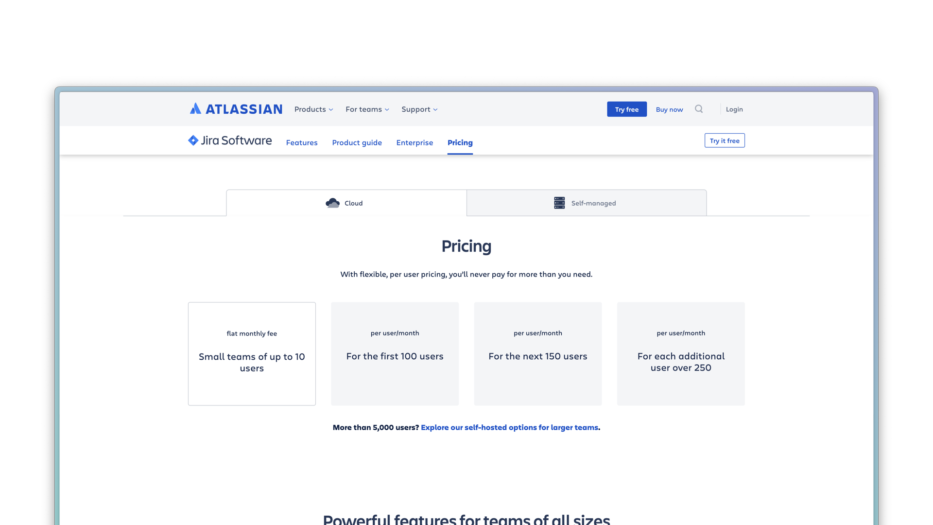 Our single pricing tier created an all-or-nothing decision
After: Multi-tier pricing & packaging
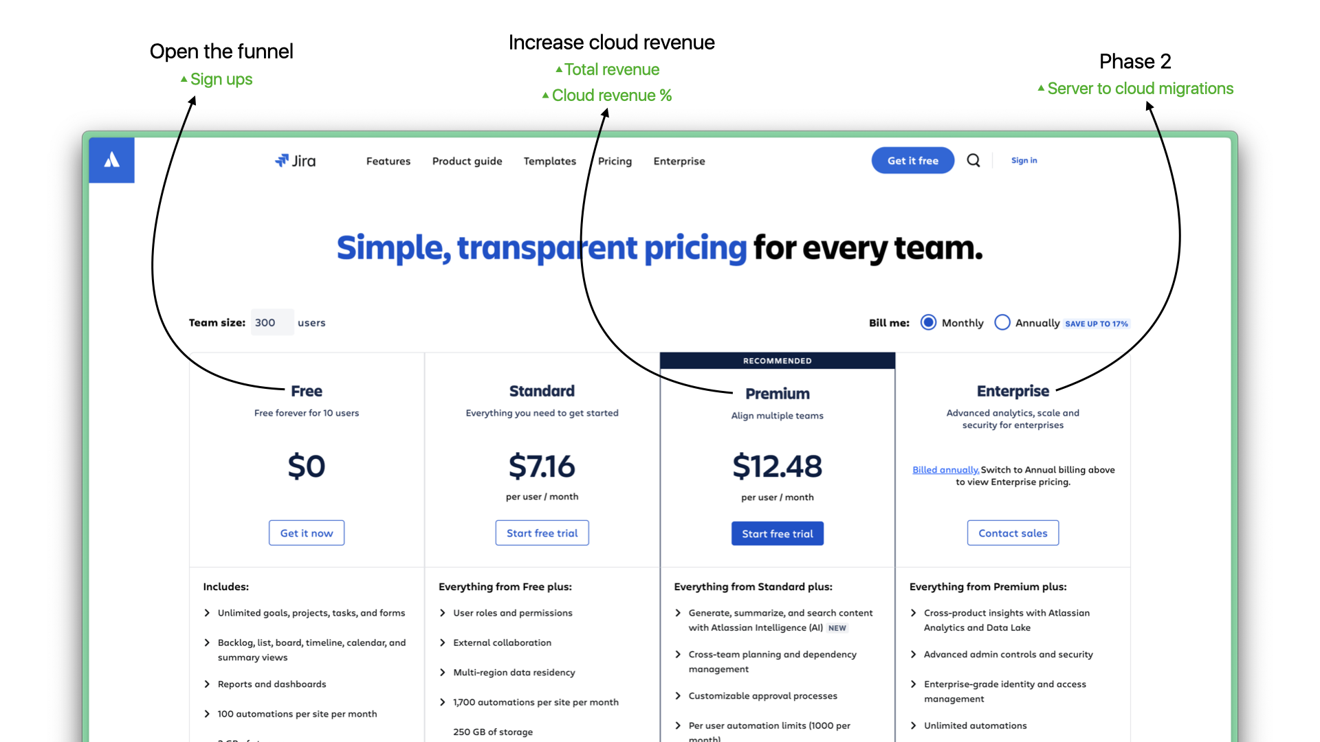 Free and Premium plans opened the funnel and created clear upgrade paths
Snapshots
Building cross-team commitment
As Atlassian’s first principal designer, my role wasn’t clearly defined. Teams across the organization had competing priorities, and program-level needs often took a backseat to individual team needs. To deliver the best possible experience, I needed buy-in from design leaders, stakeholders and contributing designers to prioritize this work.
Approach
I proposed forming a cross-functional sub-team where I served as dotted-line leader. To get buy-in from across the organization, I focused on making the case for why this work mattered and what teams could expect in return.
 I outlined clear expectations and mutual commitments
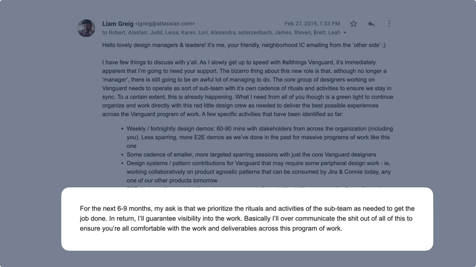 The ask was specific: dedicated time in exchange for clear visibility into the work
I also created a clear job description for my role, getting feedback from stakeholders across the organization to ensure expectations were aligned.
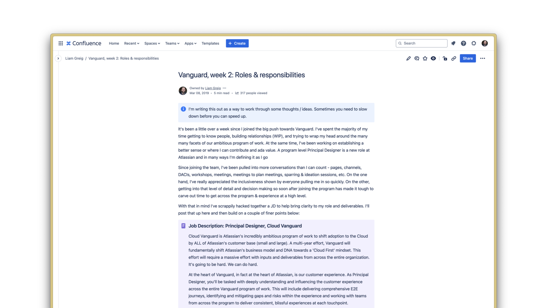 I defined my role proactively to avoid confusion later
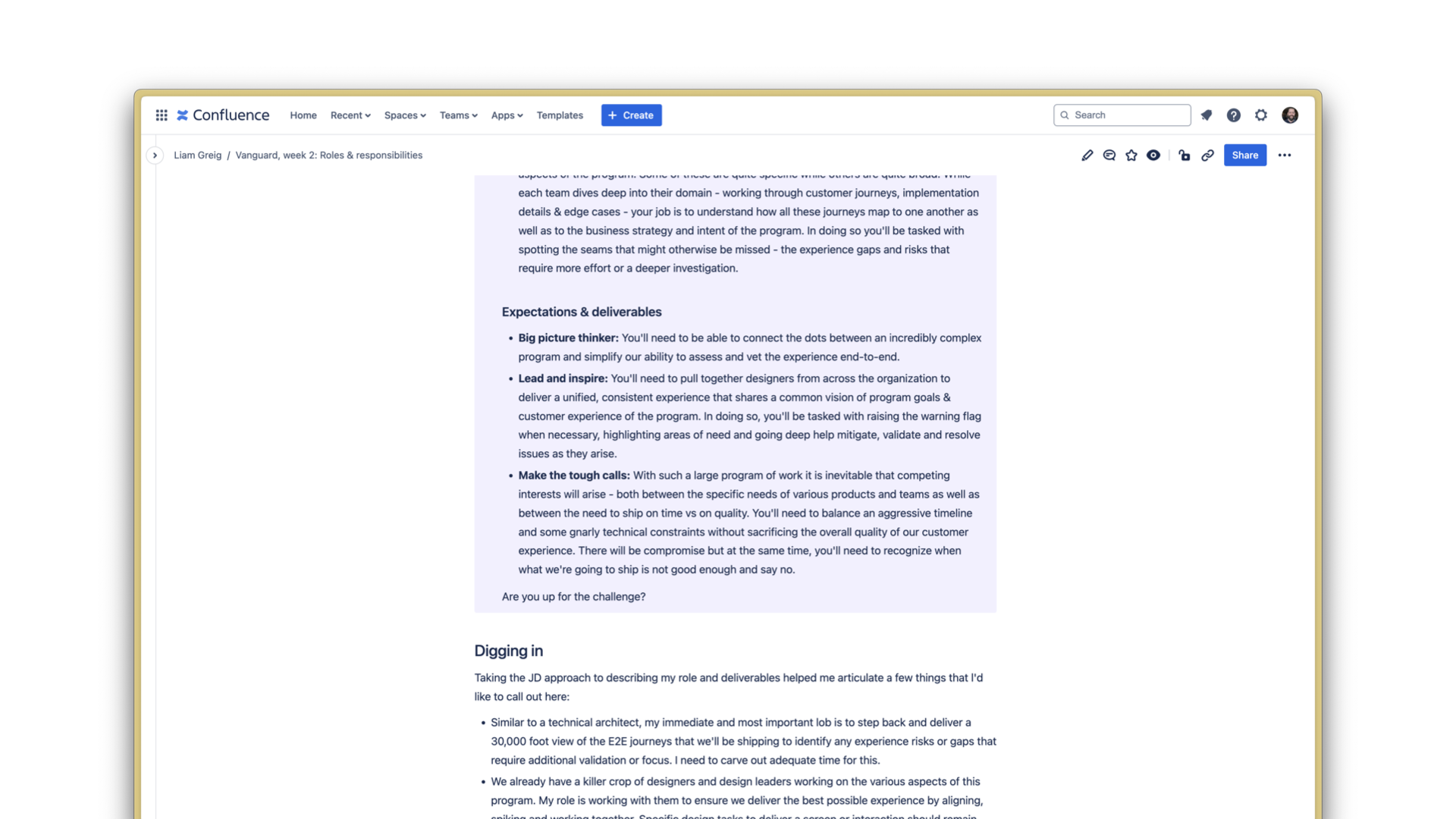 Clear expectations and deliverables helped teams understand how I viewed my role
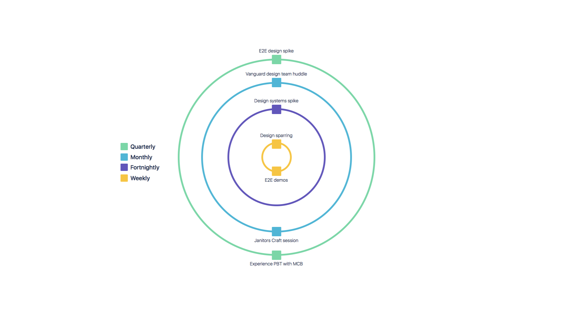 Weekly, monthly and quarterly team processes and rituals
Impact
This approach built genuine commitment and set clear expectations. Teams understood how their work contributed to larger program goals and felt supported rather than goverened. The result was higher quality output and stronger cross-team collaboration.
Defining the end-to-end experience
I joined the program midstream with customer-facing milestones approaching fast. Work was fragmented across teams with no unified direction for the end-to-end experience. I needed to quickly assess the landscape and align our teams around a shared vision.
Approach
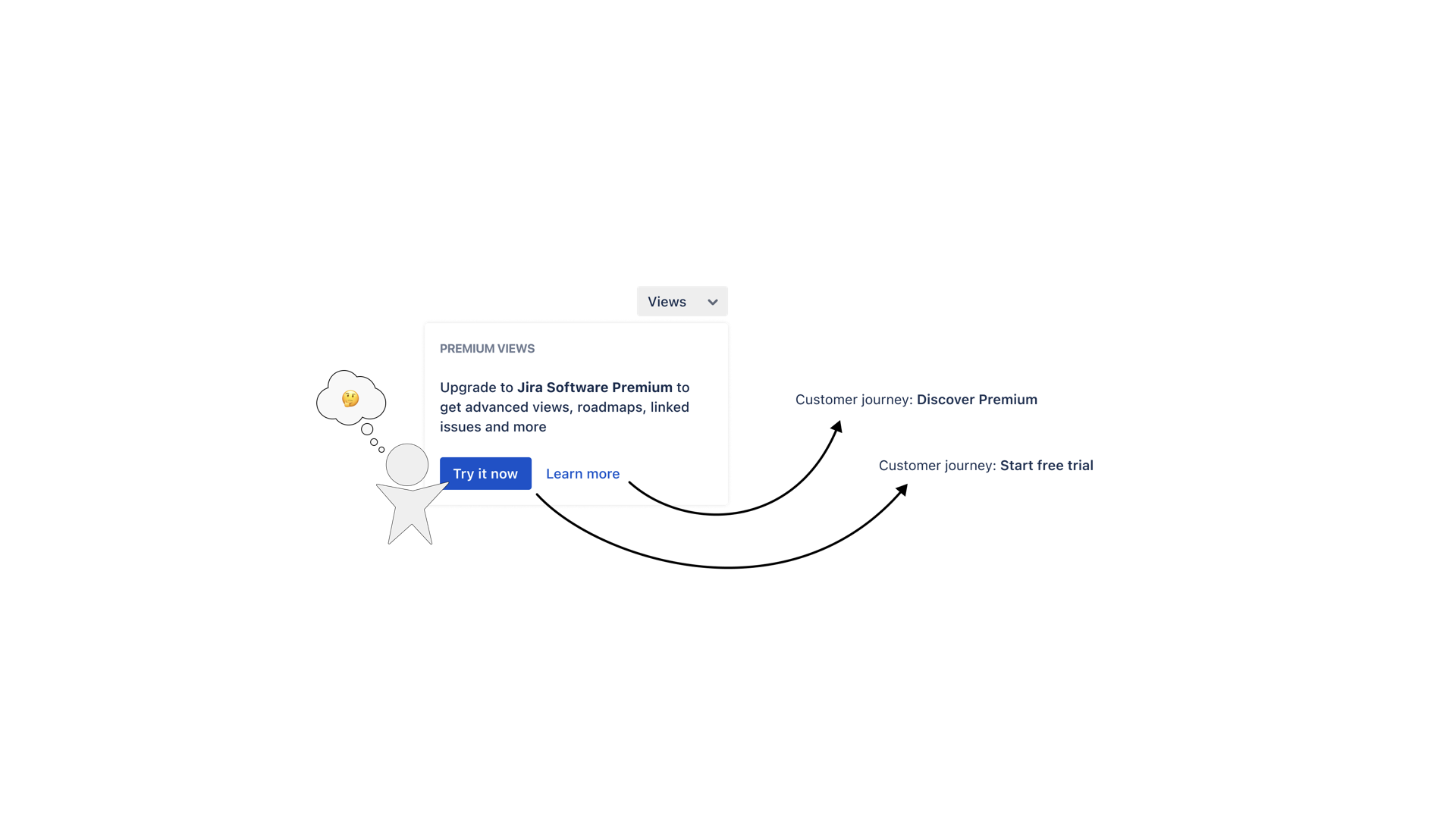
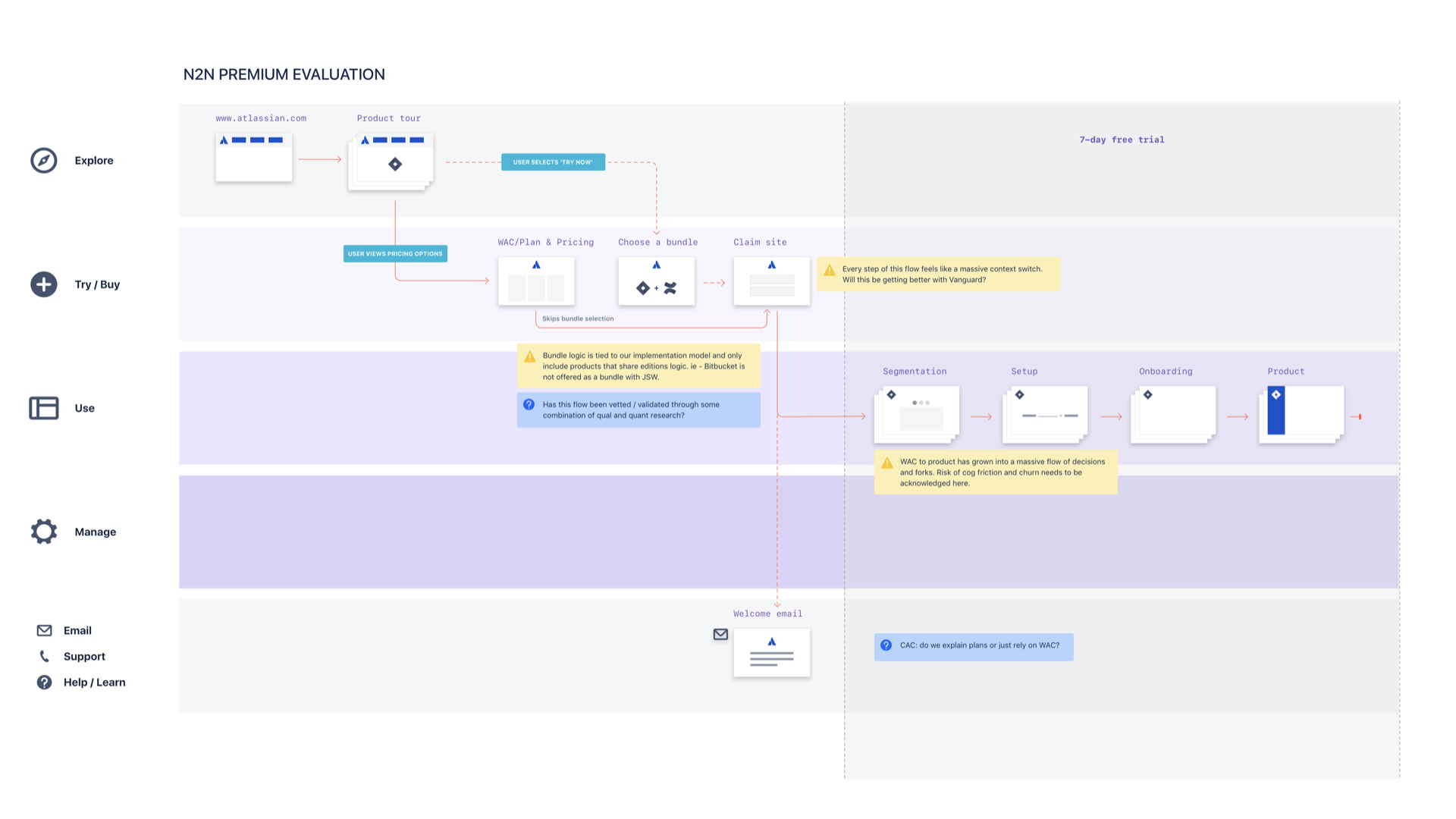
I created and shared a set of frameworks to connect every customer touchpoint across the program. Starting with simple starman diagrams to visualize critical user stories, I then planned and led a series of cross-functional workshops where the team crafted detailed end-to-end journey maps connecting all of our work.
 Simple starman diagrams helped us align on scope without getting lost in the details
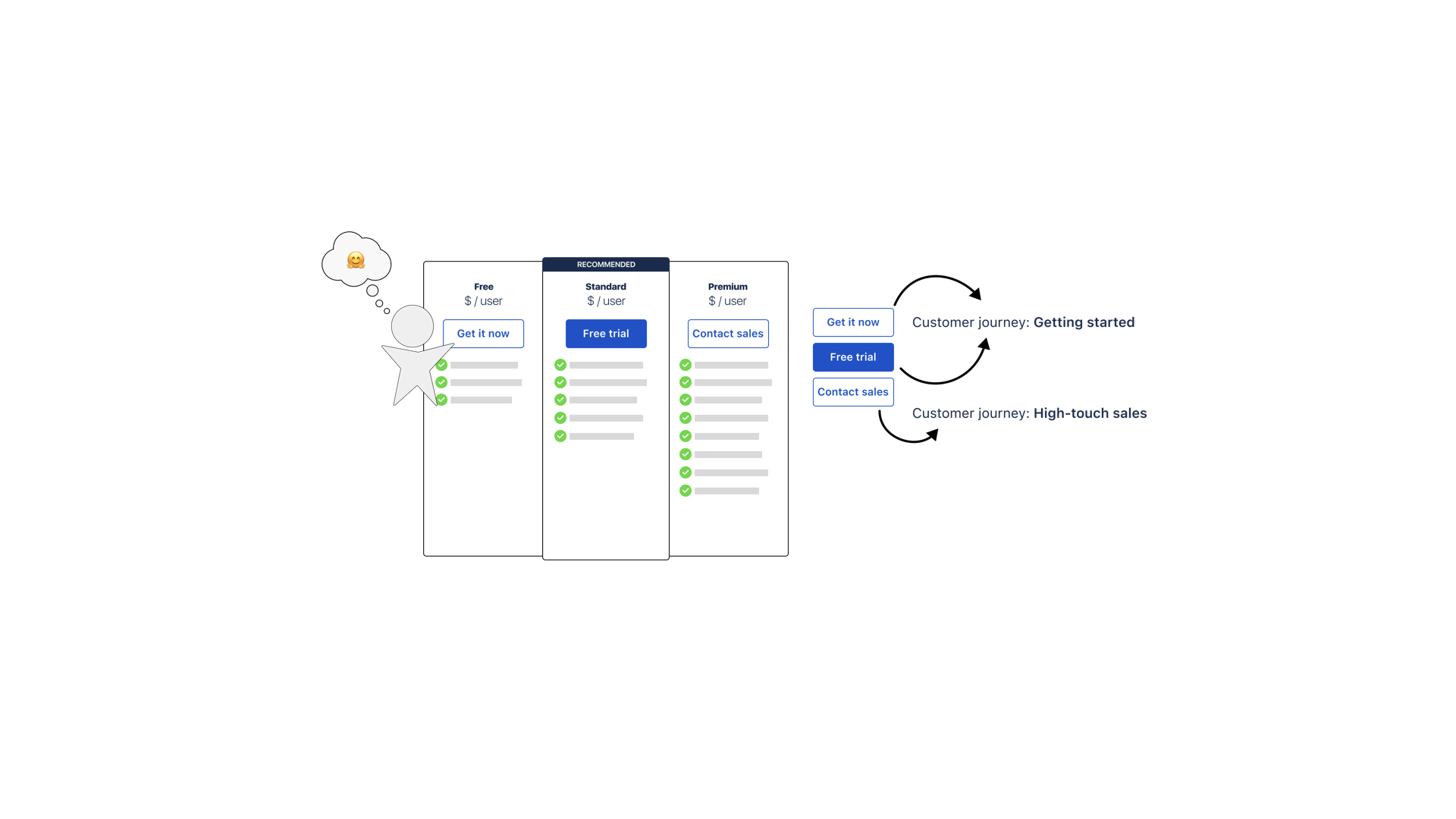
 We mapped both self-serve and high-touch sales scenarios
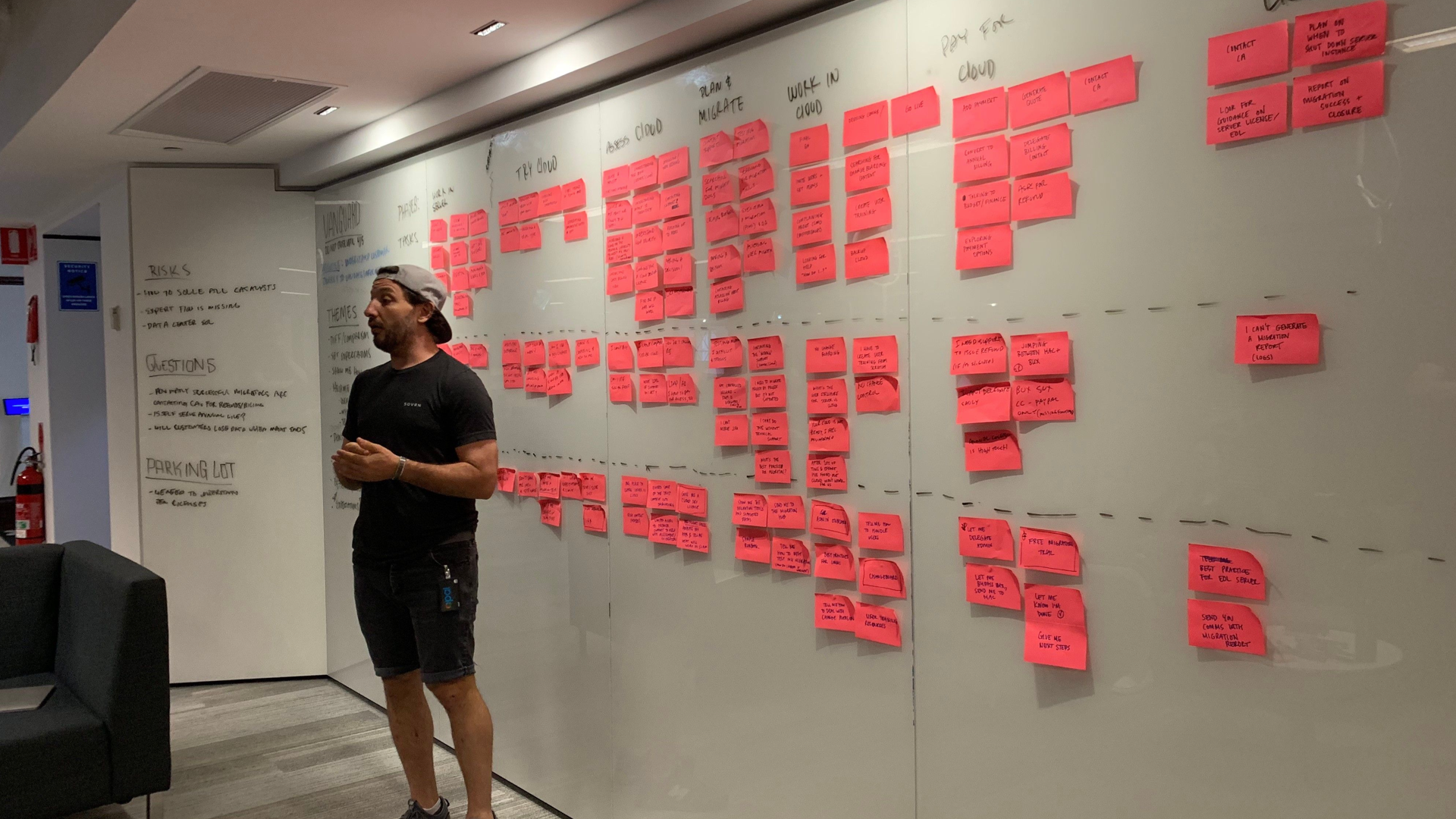 Ben, a lead designer, workshopping Enterprise journeys
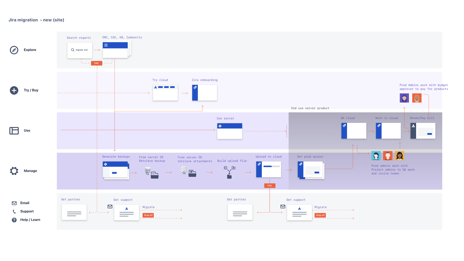 High fidelity journeys
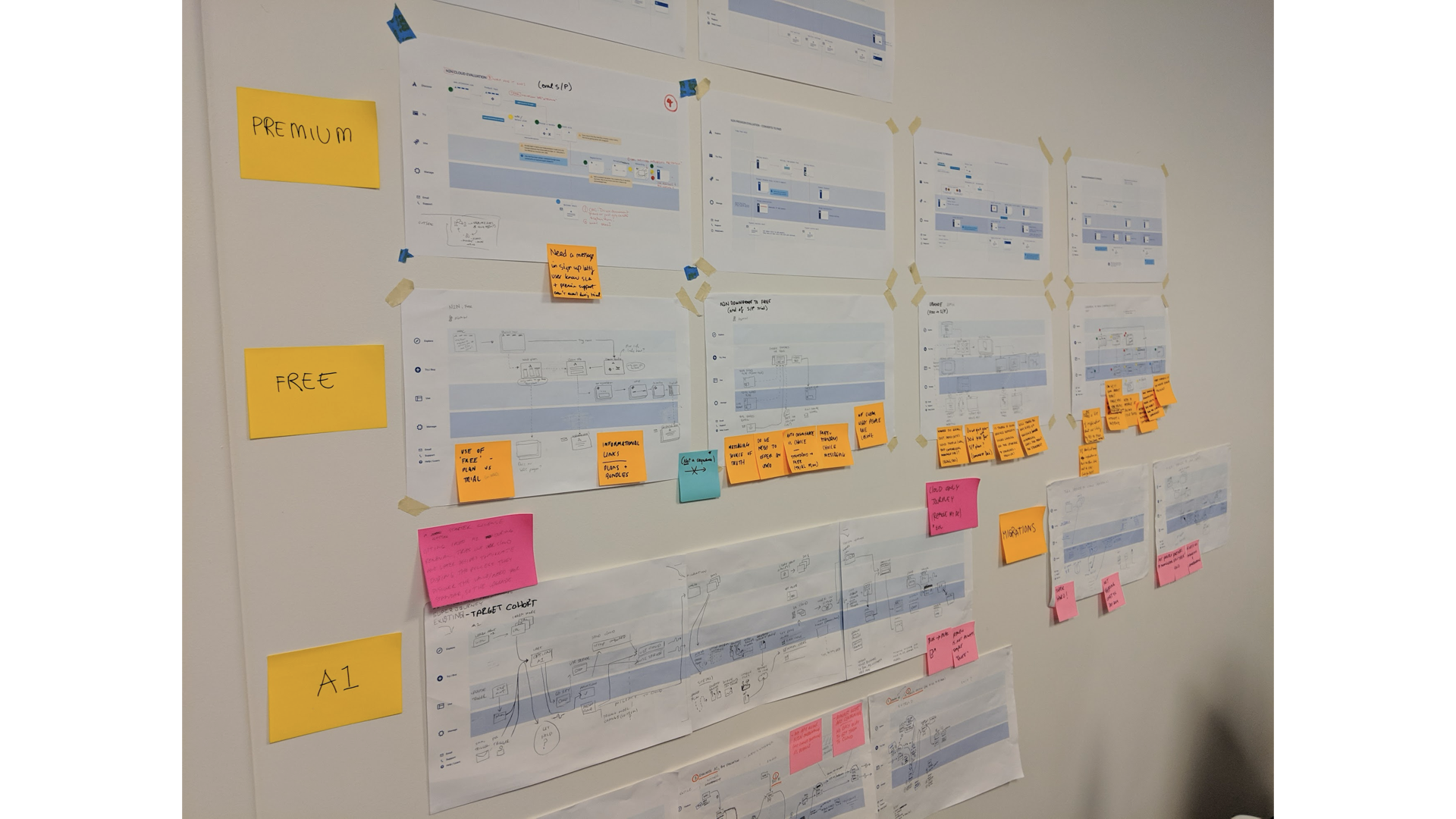 E2E journey walls set up in visible locations throughout offices
Impact
These frameworks became our shared language. Instead of teams working in isolation, we had a unified view of the customer journey that enabled better collaboration and user-centered decisions. The journey maps were showcased throughout Atlassian offices and became essential tools for demos and cross-functional go/no-go milestones.
Managing experience risk
With so many teams working in parallel on tight deadlines, experience risks were inevitable. Program management focused on delivery timelines, not user experience quality so we needed a way to identify and address experience problems before they reached customers.
Approach
Using our end-to-end journeys as a foundation, we created an experience risk register that tracked potential issues across the entire program. With contributions from across teams, we were able to define clear escalation paths and go/no-go criteria that reflected the end-user experience.
 We overlaid potential risks onto our customer journey maps
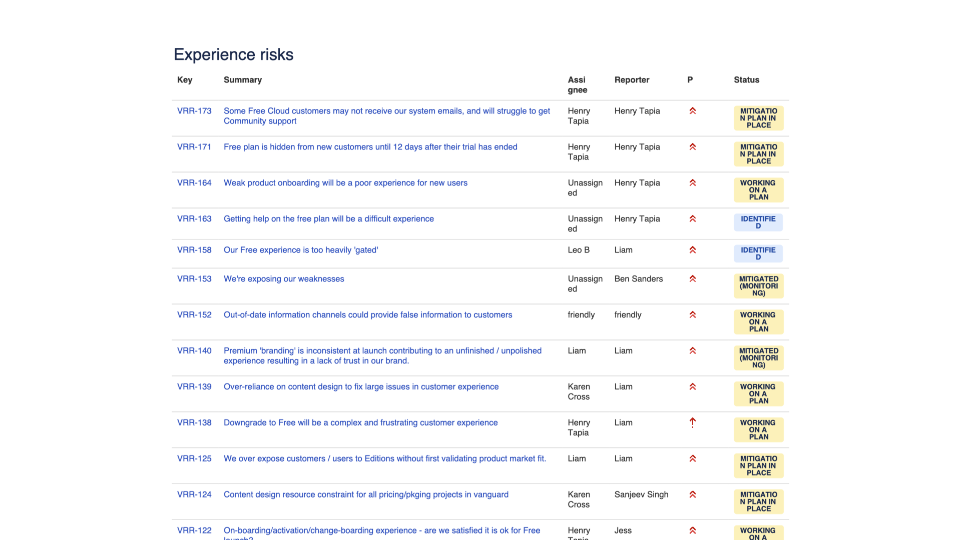 Each risk included clear owners, severity, and mitigation plans
When high-priority risks emerged, I packaged them into “clean escalations” - clear presentations of the problem, impact, and recommended solutions that leadership could act on quickly.
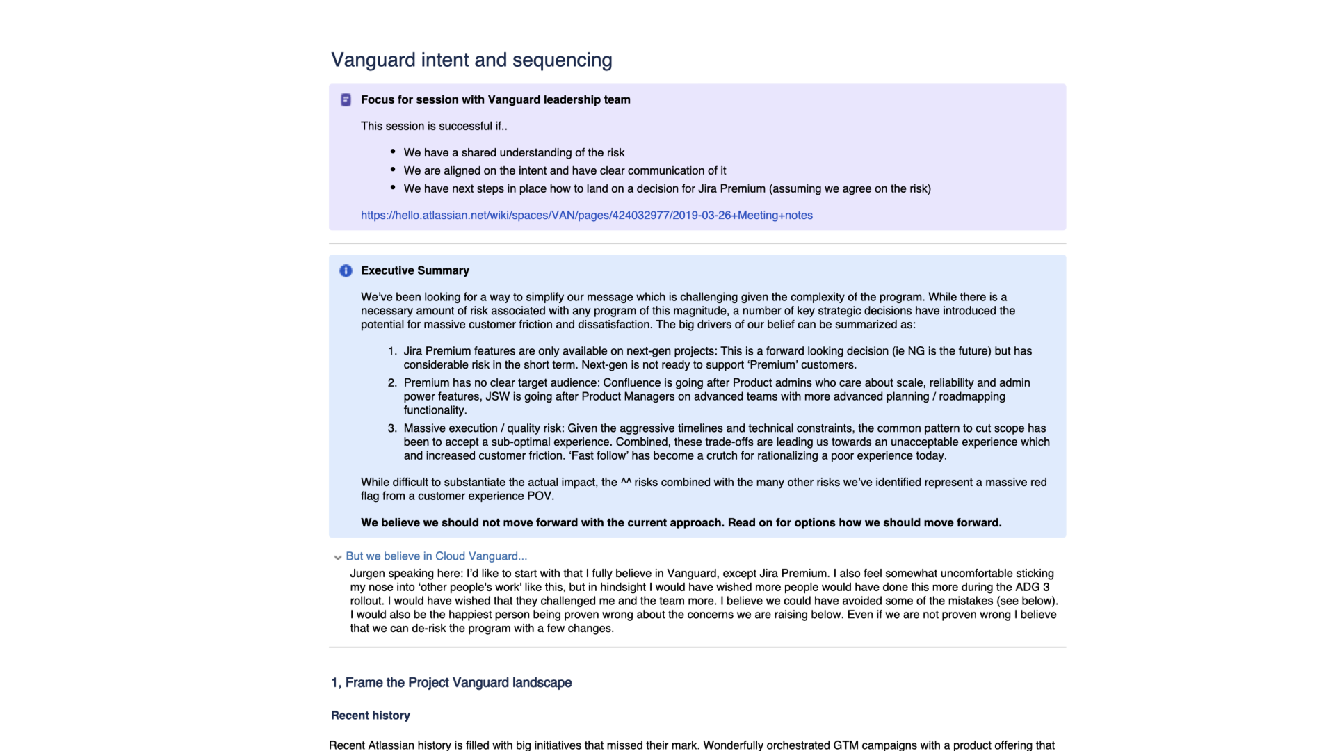 Clean escalations focused on user impact and business consequences
Impact
This proactive approach prevented major experience failures from reaching customers. By making experience risks visible and actionable, we maintained quality standards even under tight delivery pressures.
Sweating the details
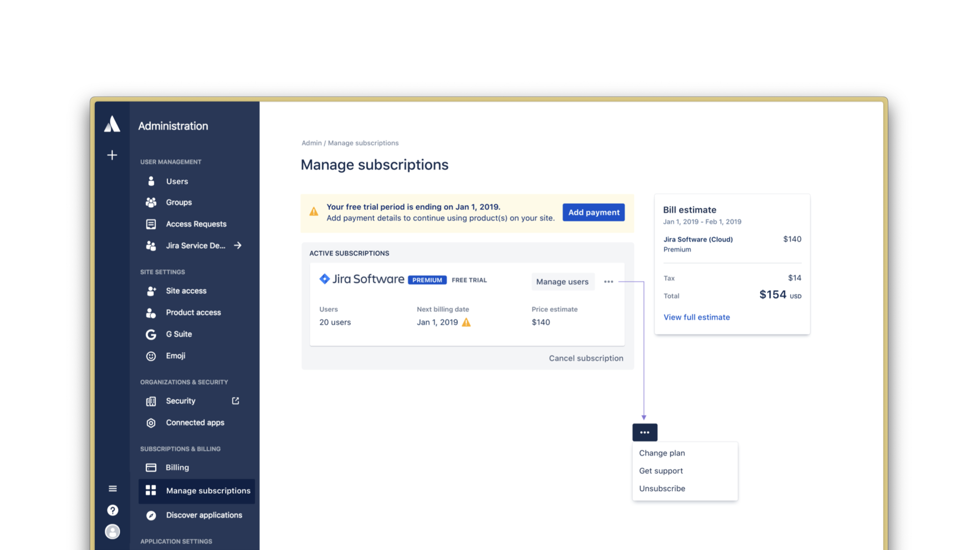
Even with strong frameworks and processes in place, some experiences needed me to get hands-on with the work. Managing subscriptions was a perfect example. The product team had introduced multiple layers of conditional logic to promote different actions depending on the user’s current plan, smart from a business perspective, but it was creating a confusing experience for users.
Approach
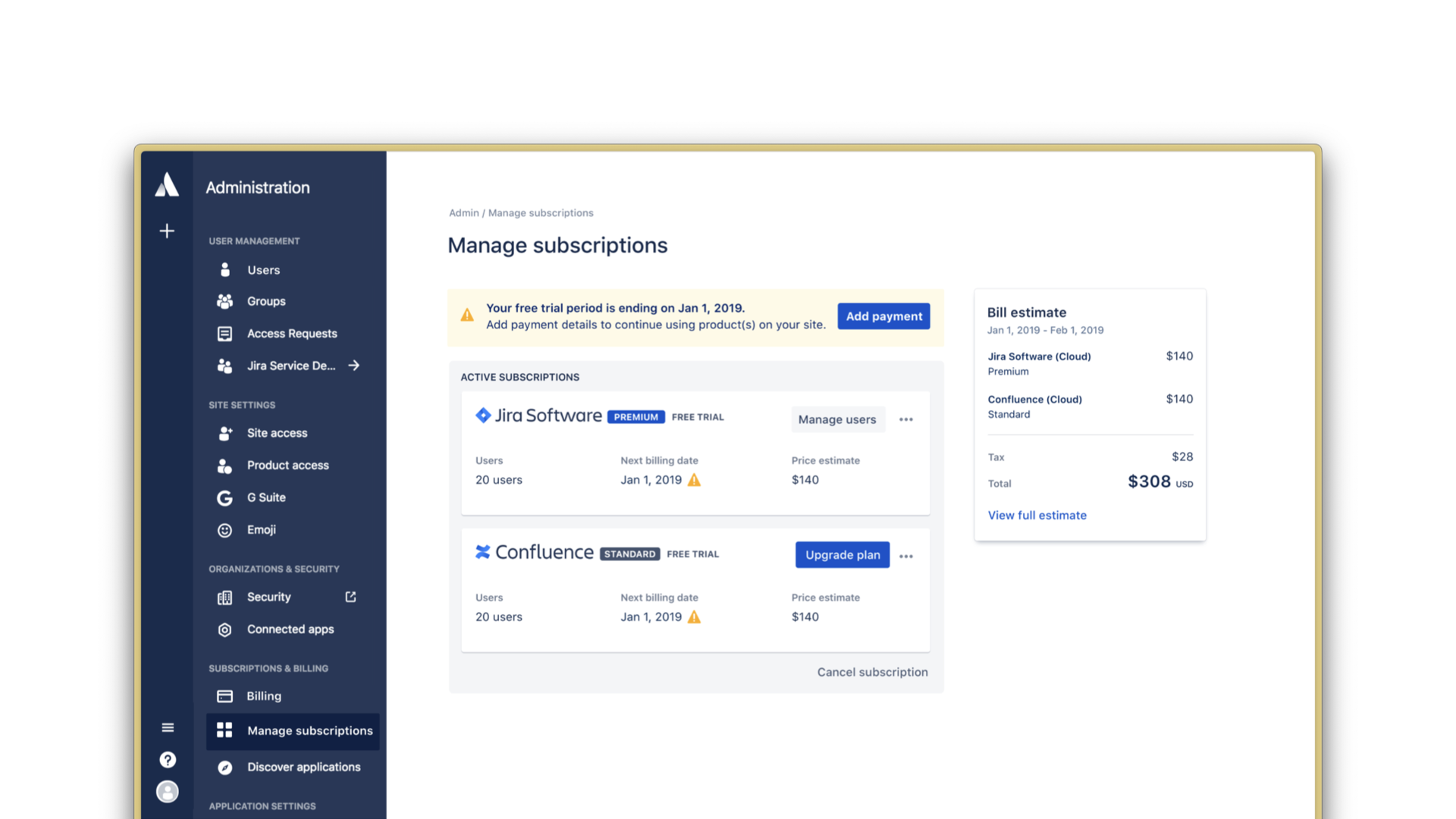
I stepped in to collaborate directly on redesigning these screens. My focus was on creating consistency and clarity across different plan types while still meeting the business requirements. We needed to reduce the competing calls-to-action and simplify the decision-making process without losing the ability to guide users toward the right next steps.
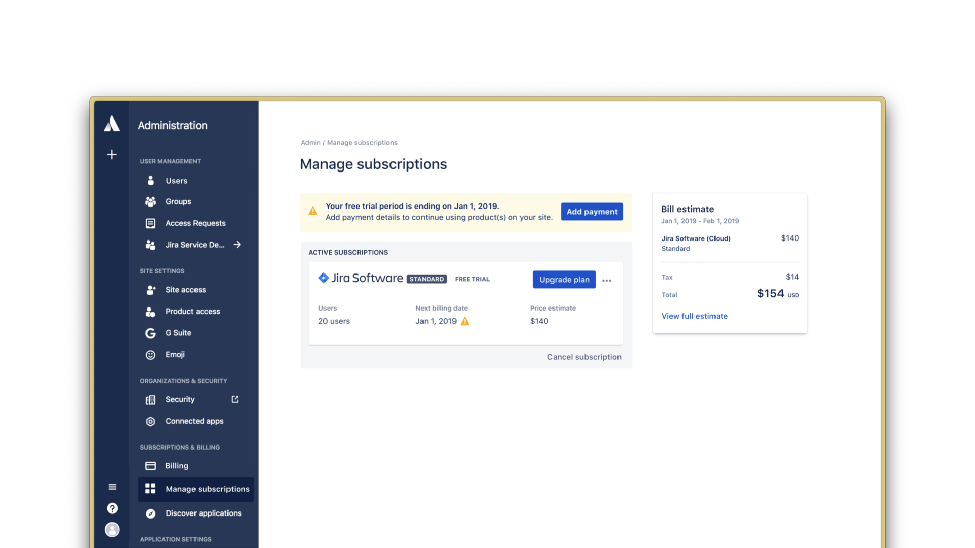 Before: Competing primary actions confused users
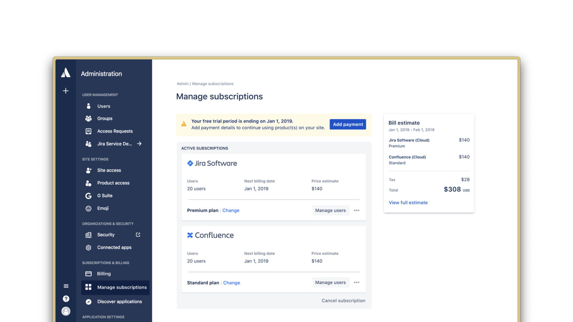
 Before: Different plans had inconsistent layouts and messaging
 After: Clear hierarchy and consistent patterns across all plans
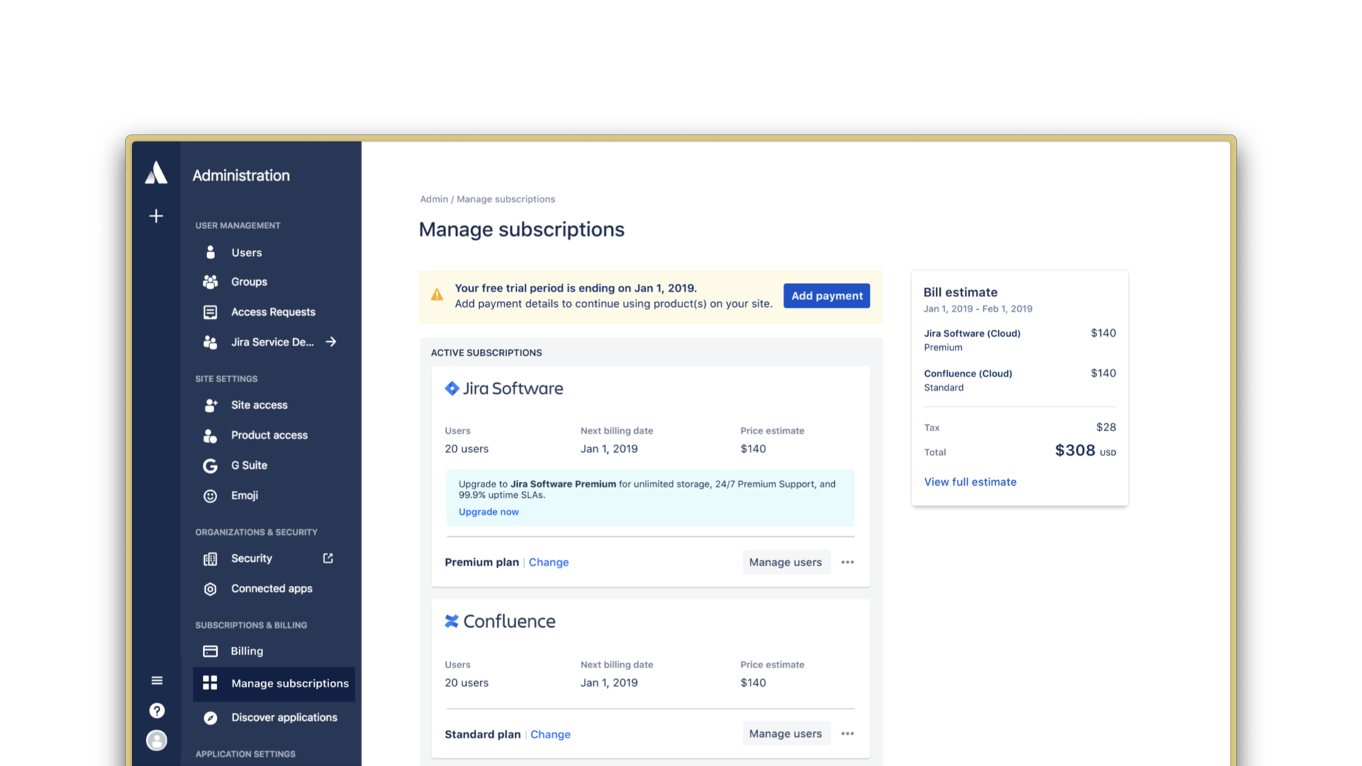 After: Simplified architecture created space for growth experimentation
Billing before and after
Impact
The redesign showed that we could meet complex business requirements while still delivering a clear user experience. By simplifying the conditional logic and creating consistent patterns, we made the experience more predictable for users without compromising our business goals. This hands-on approach also demonstrated to the broader team that high design quality was achievable even when working within significant constraints.
Reflections
Looking back, Free and Premium was was an opportunity for personal and profressional growth. It was the first time I’d led a program this complex, and it taught me a lot about what it takes to coordinate design work across multiple teams and competiting, agressive timelines.
The frameworks we built (starman diagrams, end-to-end journey mapping, experience risk registers, clean escalations) weren’t revolutionary, but they worked. Our efforts during this program, and the approach became a template for how Atlassian tackled complex, cross-functional programs in the future.
📫 Want to learn more about my work or go deeper on a case study? Get in touch.